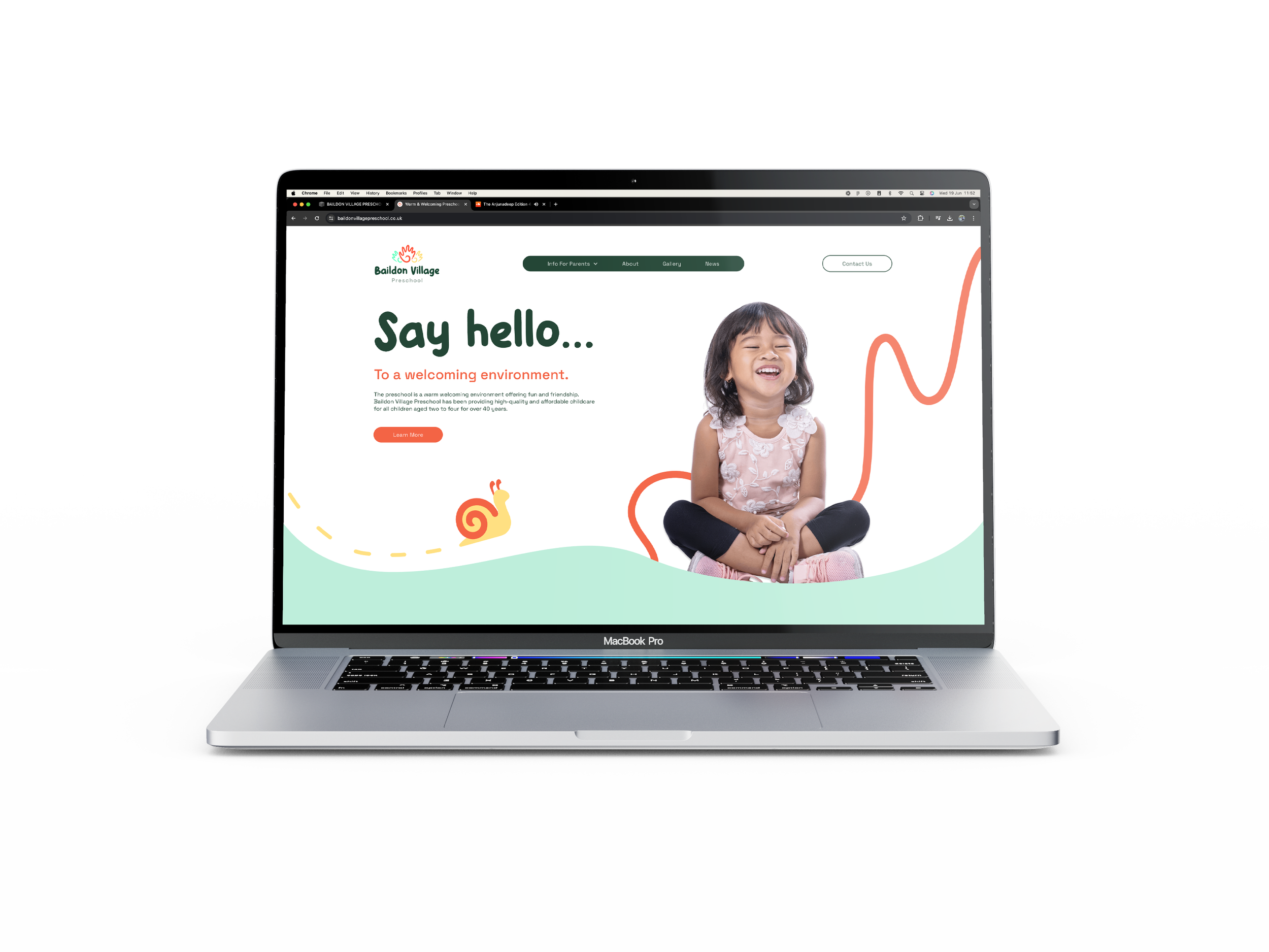
Baildon Village Preschool has been providing high-quality and affordable childcare for all children aged two to four for over 40 years.
BAILDON VILLAGE PRESCHOOL
THE BRIEF:
This brief was carried out alongside Phunk Creative. Baildon Village Preschool has been providing it’s services to the local community for over 40 years, but presently has faced increased competition. In light of this, the preschool wanted a new identity to refresh their brand and to set them apart within the market.
THE PROBLEM:
Due to the longstanding history of the preschool, it was a concern that a completely new identity would confuse their past and present customers. Baildon Preschool wanted to modernise their brand identity inline with newer competition, however it was felt that something too drastic would damage the brand resonance they had established.
THE SOLUTION:
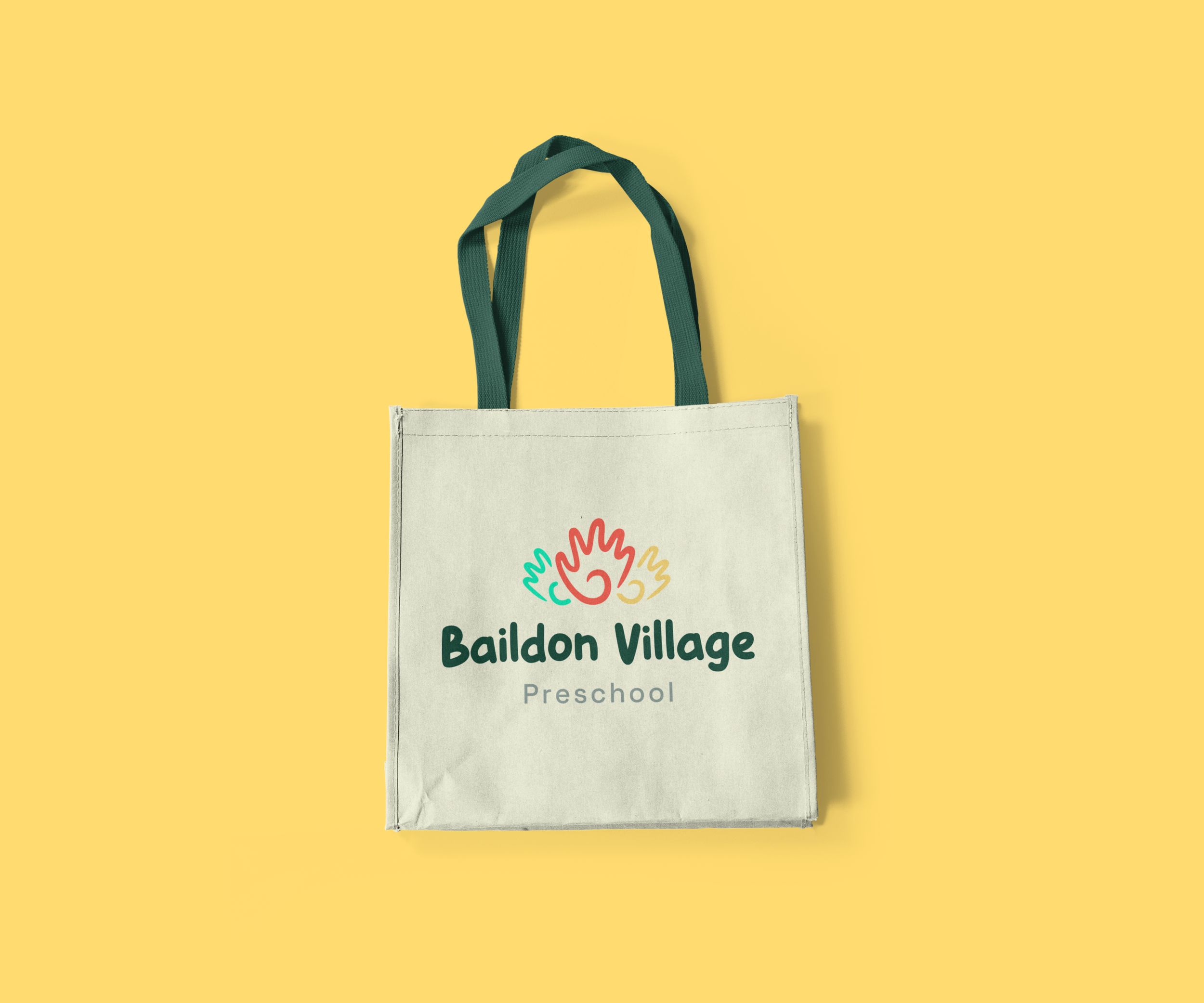
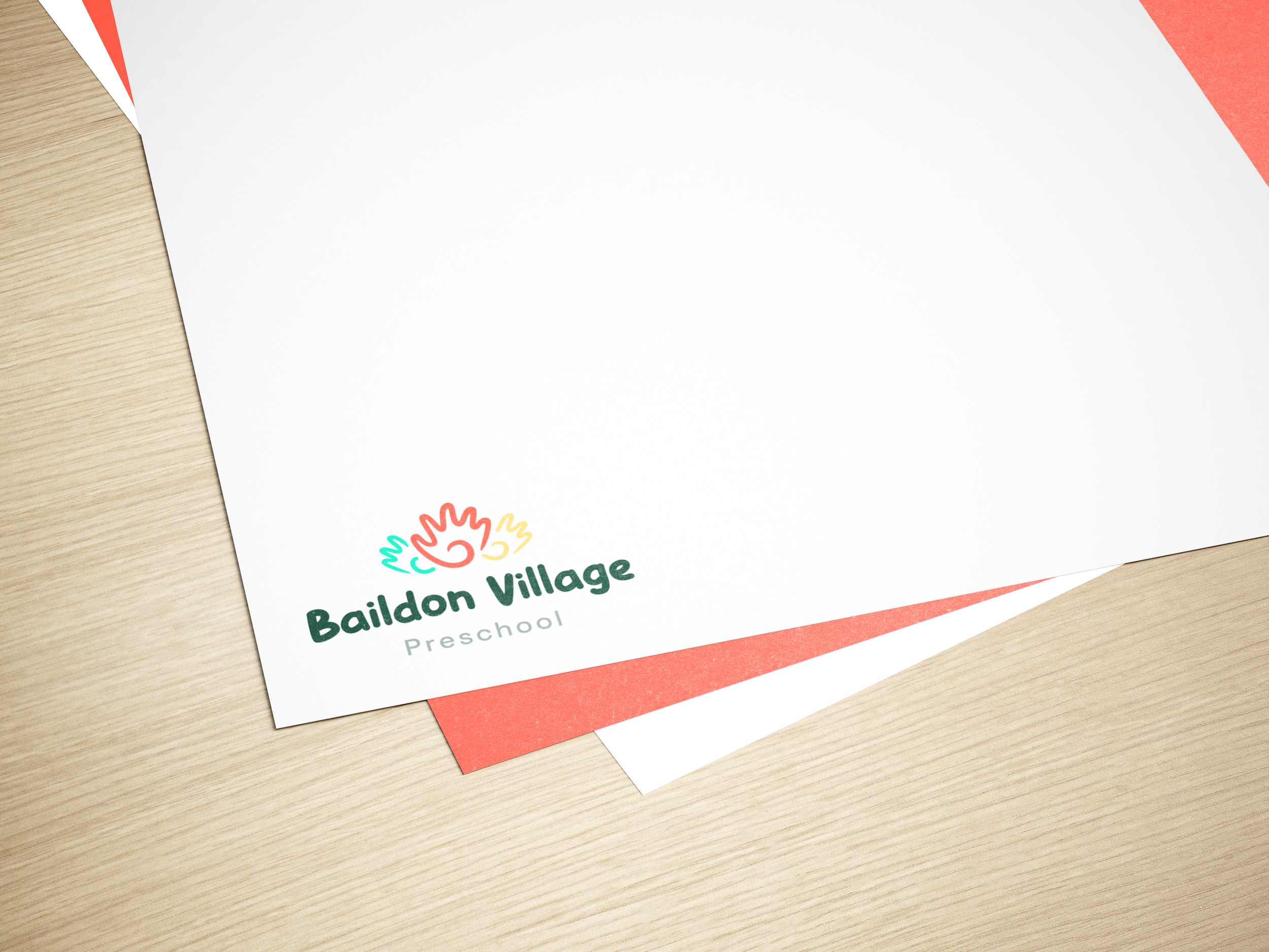
We conducted a thorough brand audit and pulled elements that we thought were crucial to the existing brand identity. We took some inspiration from these, such as the existing ‘painted hand’ logo. We incorporated hands into the new logo, and refined a selection of colours to carry forward into the brand identity. The outcome was a whole new brand identity that stood out in the market, yet throughout the new branding we incorporated subtle nods to the old identity to retain a sense of familiarity.

