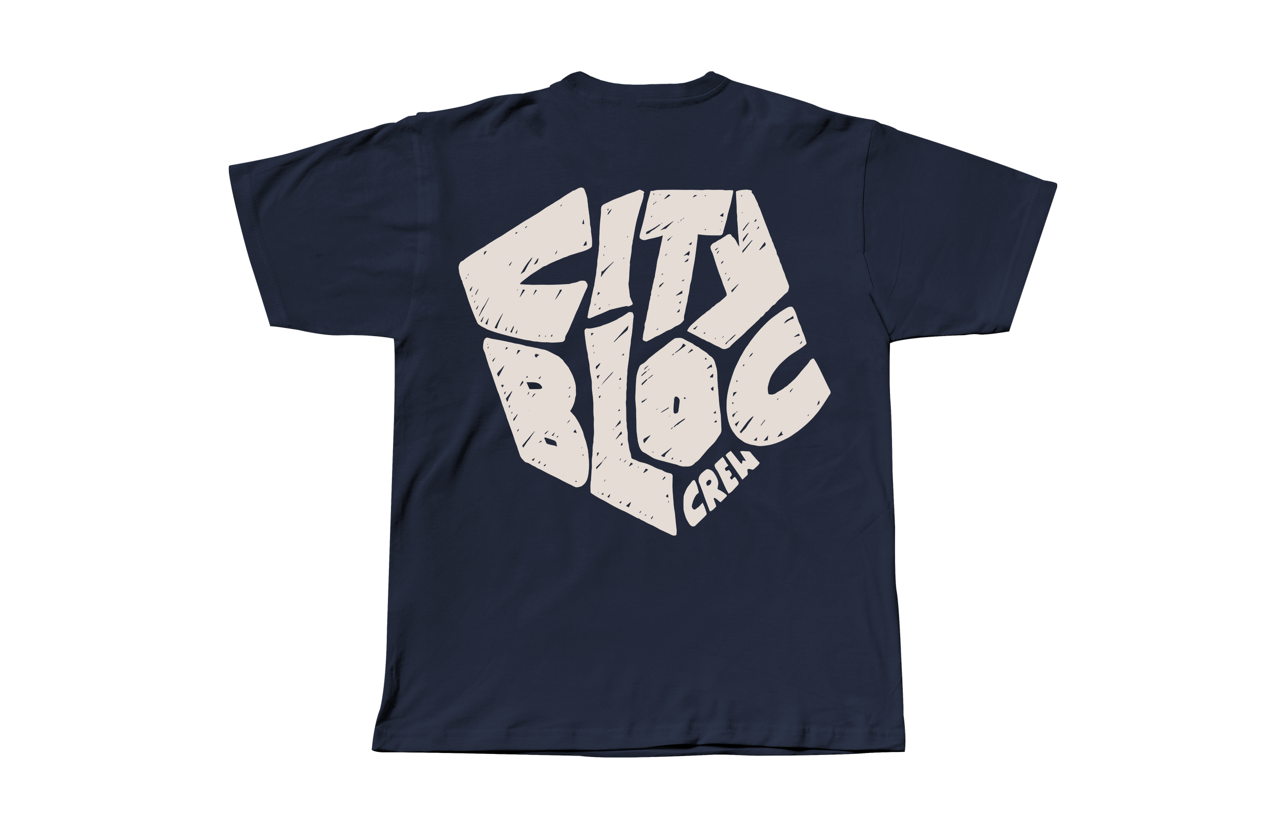
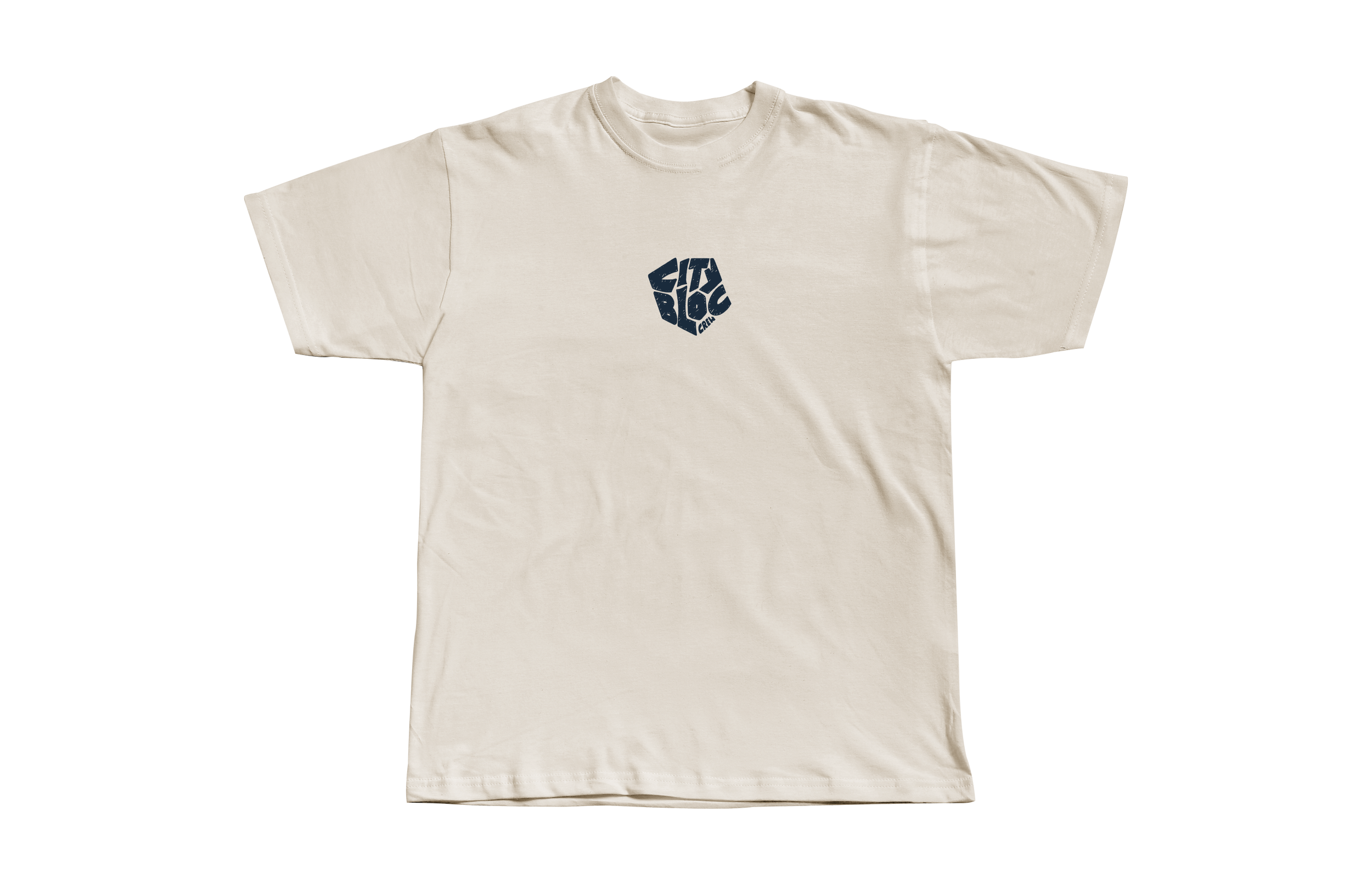
CITY BLOC
CITY BLOC IS AN indoor bouldering centre, BASED IN THE HEART OF LEEDS, AND IS THE HOME OF ‘PROPER’ CLIMBING.
THE BRIEF:
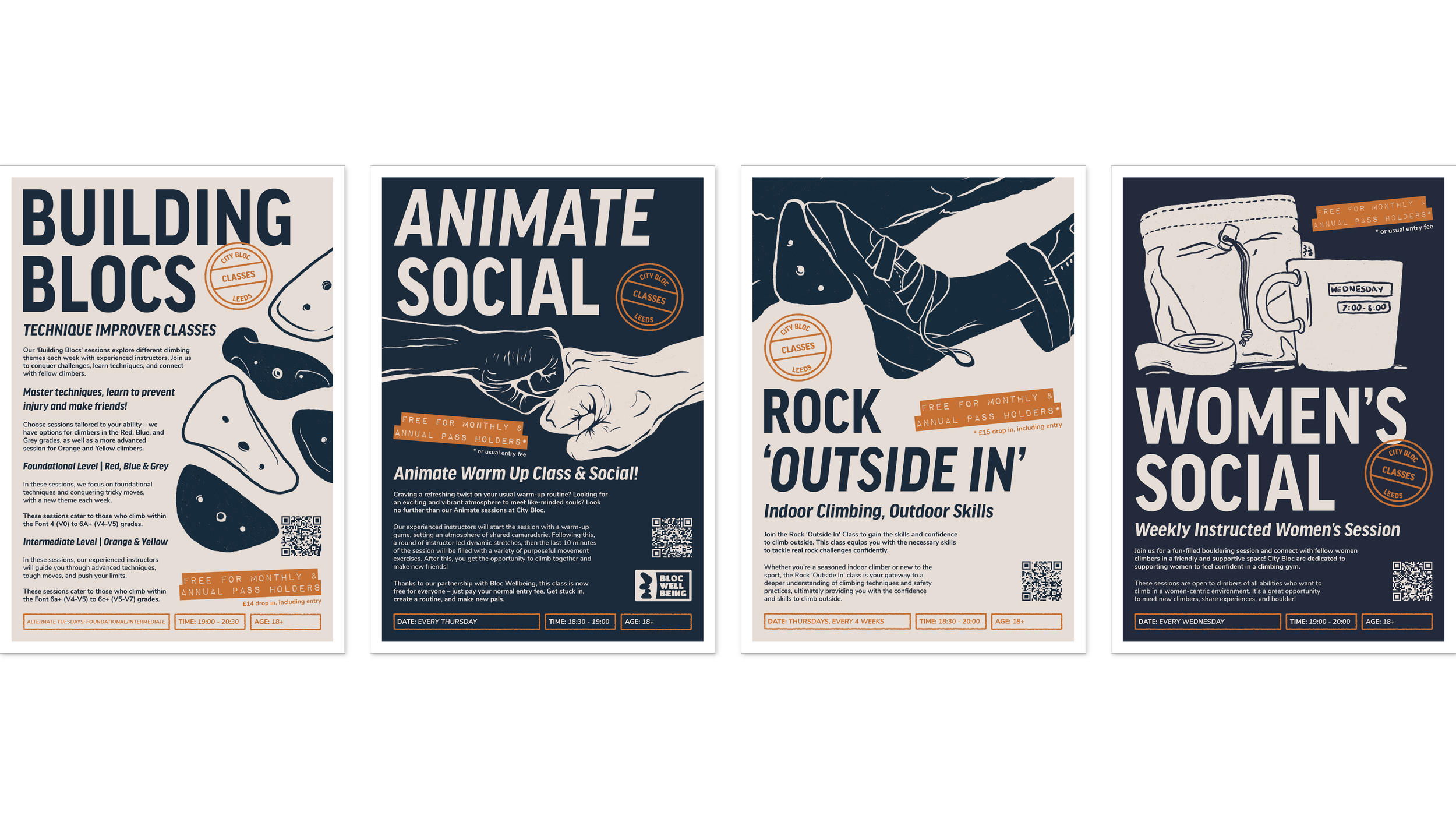
This project started off a live collaboration with City Bloc, as part of my final major project at university. It has since turned into freelance paid work on the back of it’s success. The brief was to conduct a brand audit and carry out a ‘rebrand’ in line with City Blocs’ desired visual brand outcomes, as well as produce a body of work that resonated with who they are.
THE PROBLEM:
City Bloc is the first dedicated bouldering wall in Leeds, founded by GB climbing alumni. Over recent years, the competition has grown within Leeds, increasing the need for independent climbing walls to retain visibility. City Bloc felt it had an outdated, confused brand system that had been built on by different designers over the years, leaving a ‘messy’ and confused brand identity with no significant brand resonance.
THE SOLUTION:
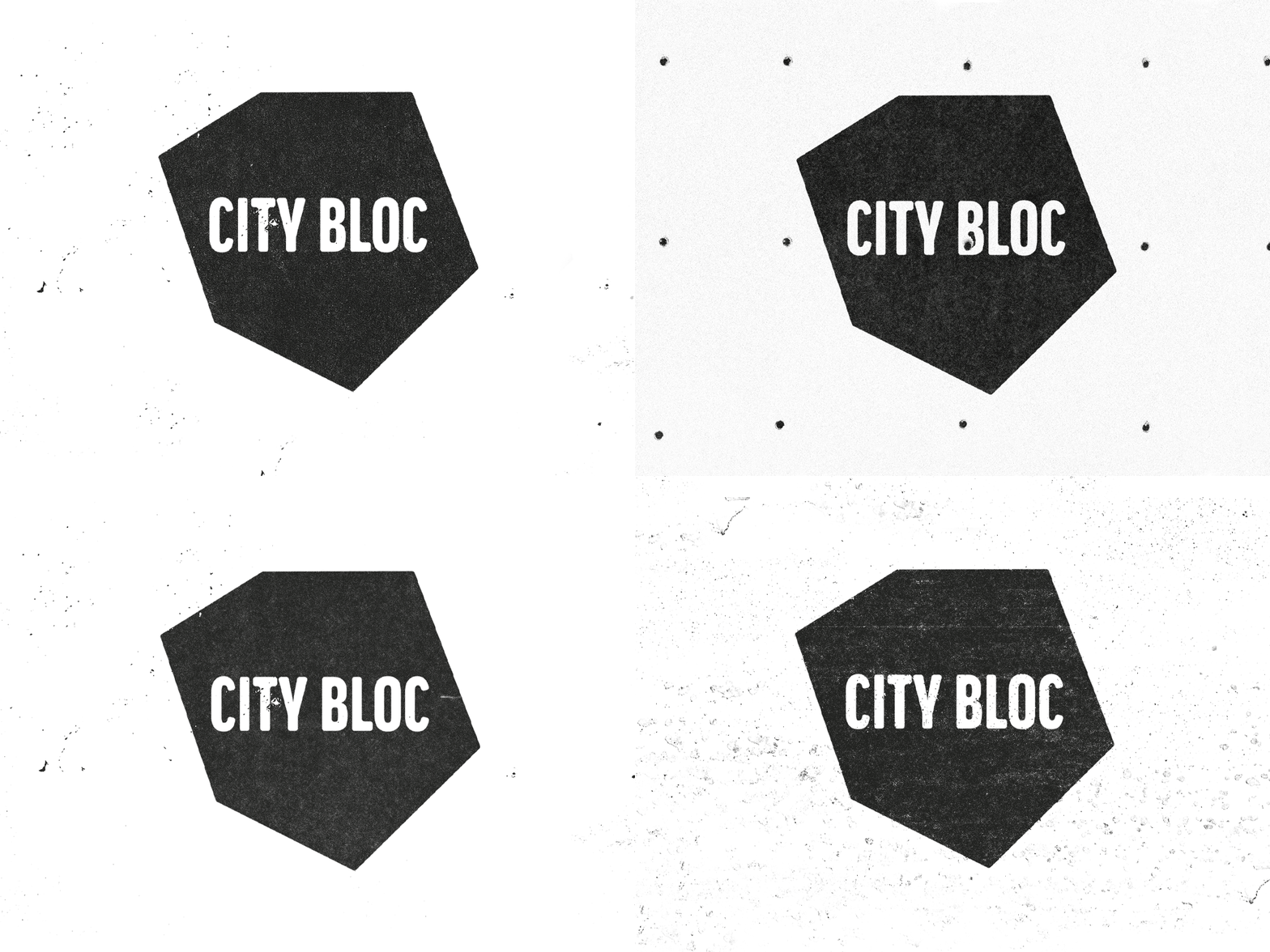
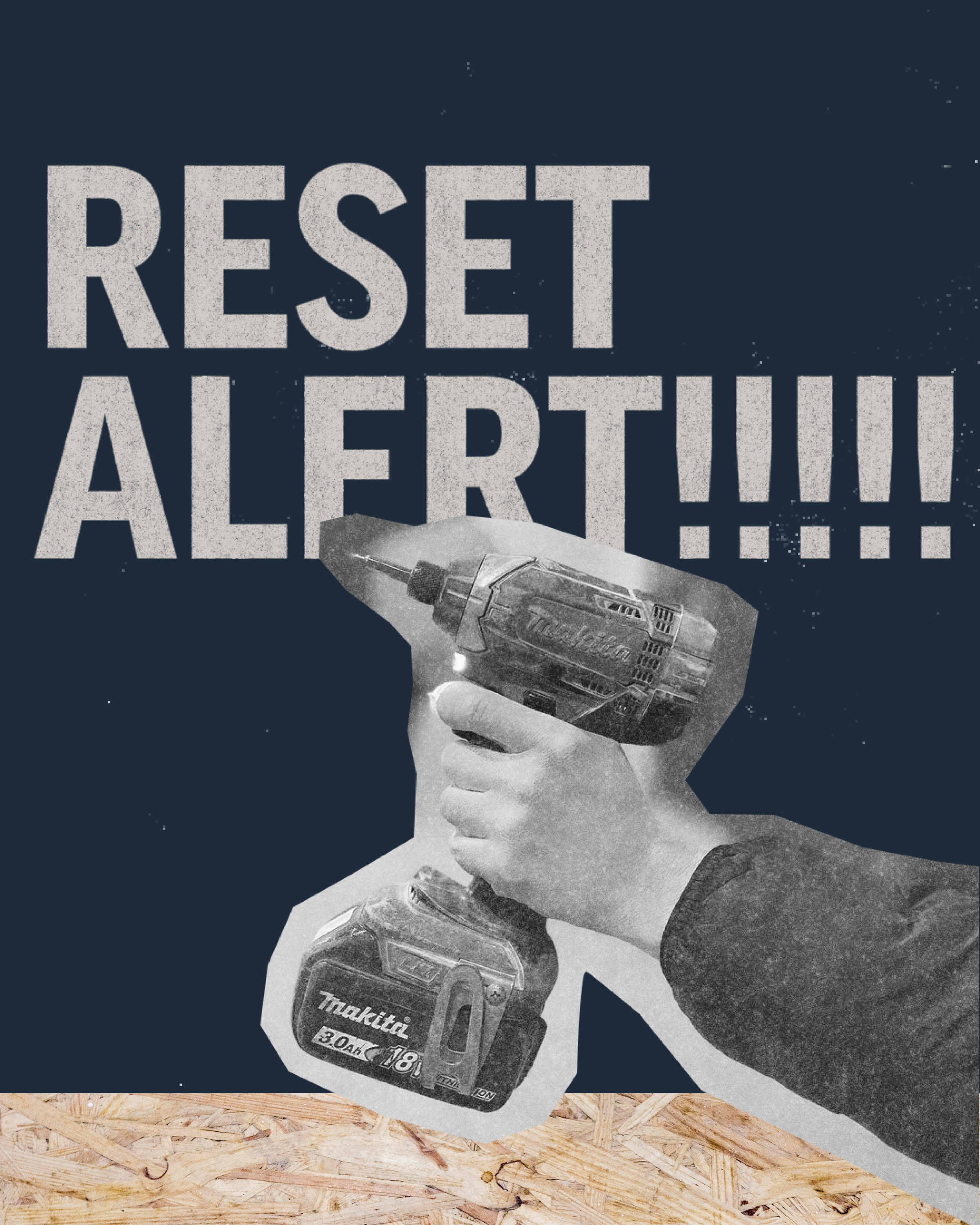
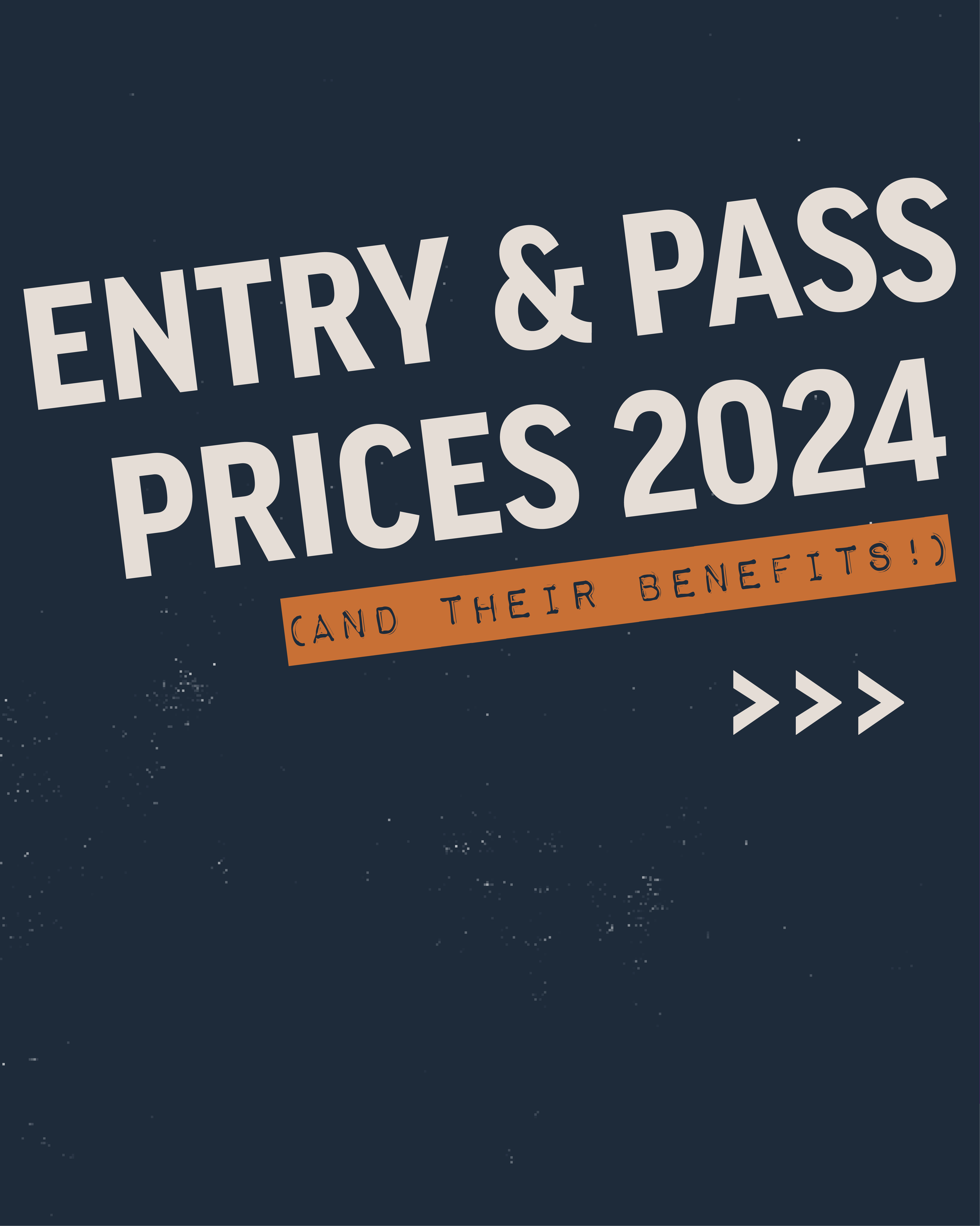
I conducted a thorough brand audit of all things digital and in centre, and maintained client communication to ensure the direction was in line with the aims and values of City Bloc. The agreed direction was to ‘strip back’ the branding, only keeping the heritage logo and minimal assets, and reimagine City Bloc as a stand out brand within the current market. City Bloc prides itself on it’s ‘DIY’ approach, feeling that their efforts are mostly focused on high quality route setting. This was carried forward into the visual branding, and the ‘rugged’ yet professional visual branding encapsulates the brands’ ethos, and visually sets City Bloc apart from their competitors.
